Implementing Focus Traps
Everybody loves cookie banners. Personally, I think there is no better experience than reading the first few paragraphs of a page, just to be interrupted by a giant modal window that tells you whom you should sell your soul to. Modal windows in general are problematic when it comes to Web Accessibility, as the accessibility tree stays accessible for keyboard controls, allowing the user to access content in the background, if the developer does not intervene. This intervention is called Focus Trap.
Table of Contents
Common Ground
Usually modal windows require user interaction and should not be skippable. There are a few use cases aside from cookie banners, but ultimately you will have something that matches the following accessibility tree.

On the left side you see a <dialog> element - a <div> with
aria-role=dialog - that contains a heading, some text and controls. This could
be a minimalistic cookie popup with ‘accept’ and ‘decline’ or a confirmation
dialog with ‘yes’ and ‘no’ buttons. Put some additional controls - <input>
elements - into it and, you have a password prompt. You get the idea.
Next to it, you find the main element. Because a modal window is always
displayed on top of your page, it should be the first element in your body.
Sometimes you see them defined at the bottom of the markup. This is semantically
incorrect, because here the DOM position does not necessarily correlate to the
window’s position on the screen. A modal window has the highest priority when it
comes to user interaction.
When
navigating by keyboard alone,
the modal window’s interactive elements should always be selected first and the
selection should not spill into the <main> element. Let’s have a look on that.
Cookie Banner
The European Union General Data Protection Regulation requires owners of websites to inform visitors about any tracking that might create a digital fingerprint from them and get their consent. The full statement is cited below.
Natural persons may be associated with online identifiers provided by their devices, applications, tools and protocols, such as internet protocol addresses, cookie identifiers or other identifiers such as radio frequency identification tags. This may leave traces which, in particular when combined with unique identifiers and other information received by the servers, may be used to create profiles of the natural persons and identify them.
Over the last few years this totally went out of hand. Websites competed for the biggest, most obnoxious cookie banners. Some require the visitor to manually uncheck a box for each description there is; some hide that option behind an accordion. Some use a color scheme to deceive the user into consenting by suggesting the ‘accept’ button means ‘decline’ and vice versa. On top of that, absolutely no effort went into making these monstrosities WCAG2.1 compliant.
The GDPR never intended it to be implemented this way. From an accessibility standpoint, it’s a nightmare. As a front-end dev who always wants to provide the best user experience possible, we know better.
Let’s start with a simplified banner that allows the user to choose between
levels of consent. Create a new HTML file and put a simple <div> structure in
the <body> like shown below.
Please refer to my code on my GitHub page or JsFiddle as template and have a look at the cookie banner defined in the markup.
<dialog id="cookie-banner" class="popup-overlay modal" aria-modal="true">
  <div class="popup">
    <div>
      <h2>Cookies 🍪</h2>
      <p>
        Very important information in regard to whom you will sell your soul to.
      </p>
      <p>
        Allow or Prohibit:
      </p>
      <div class="popup-controls popup-controls-checkboxes">
        <input id="technical" type="checkbox" checked>
        <label for="technical">Technical Cookies</label>
        <input id="analytical" type="checkbox" checked>
        <label for="analytical">Analytical Cookies</label>
        <input id="thirdParty" type="checkbox" checked>
        <label for="thirdParty">3rd Party Cookies</label>
      </div>
    </div>
    <div class="popup-button-container">
      <button class="accept" onclick="hideOverlay(true)">
        Accept
      </button>
      <button onclick="hideOverlay(true)">
        Decline
      </button>
    </div>
  </div>
</dialog>
This will render a rudimentary window that calls a hideOverlay function on
button press. The ‘accept’ and ‘decline’ buttons are distinguishable by
different colors as defined in the CSS. I won’t go into detail on all that fancy
flex stuff.
Open the HTML file with the browser of your choice. You should see a page similar as below.
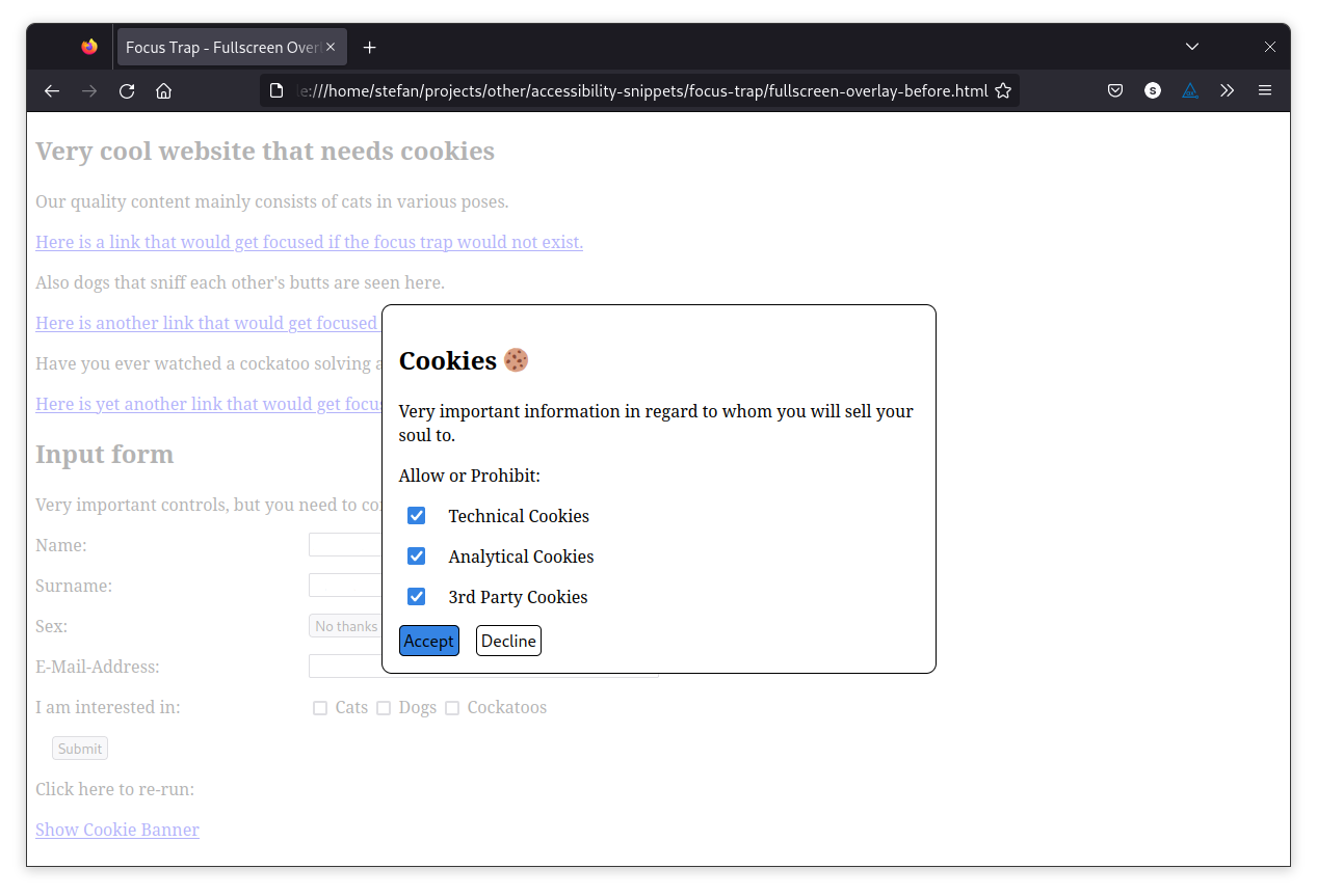
Try navigating by pressing the Tab key. Because the cookie banner is the first
thing on the body, this window’s controls will be selected first. Pay attention
to what happens after you pass the decline button.
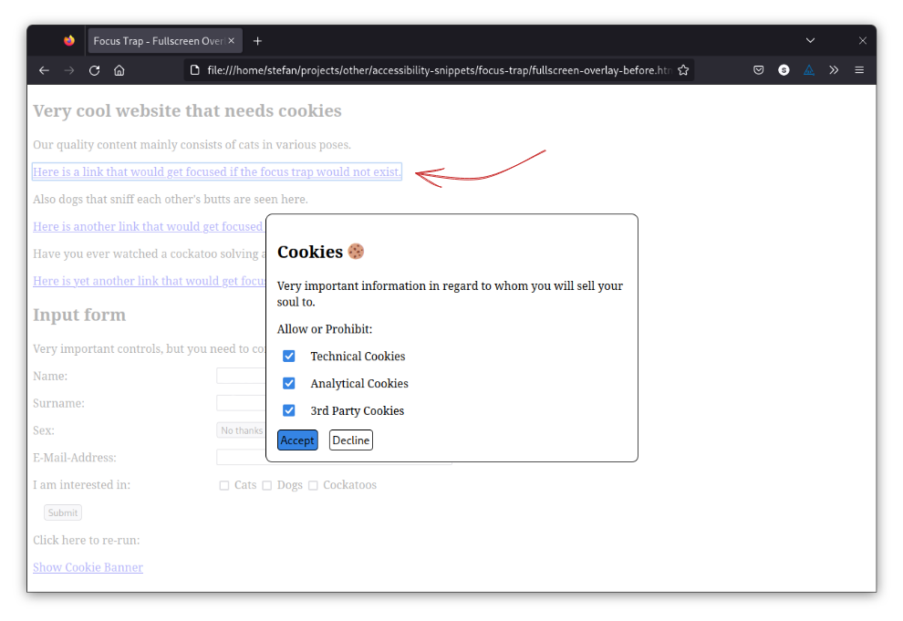
The link in the background gets selected, and you can cycle through all available controls because the focus trap has yet to be implemented.
You can do so with some JavaScript coding. The modal CSS class indicates that
a modal window is present. So, if the Tab key has been pressed, we could look
into the DOM to check if this class is assigned to any element and only allow
cycling through child nodes.
Start with adding an event listener that triggers when the DOM has been loaded and define a list of elements that you want to enable receiving focus. You can use the containers’ CSS classes for that like shown below.
document.addEventListener("DOMContentLoaded", () => {
  const focusableElements = Array.from(document
    .querySelectorAll(
      "div[class~=popup-controls] > input, div[class=popup-button-container] > button",
    ));

  // ...
});
Side note: The class~=popup-controls
CSS selector
returns all elements that possess the popup-control class non-exclusively,
whereas class=popup-button-container will strictly check for the
popup-button-container class and exclude elements that have more classes
assigned.
Now that the list is defined, a Tab keydown event listener is needed. Any time
the event is targeted on an element that is not part of the cookie popup, either
the first or the last element in the popup should be selected, depending on
whether the Shift key also has been pressed or not. Shift + Tab cycles
through the elements in reverse order.
Get the first and last element from the previously defined array.
const first = focusableElements[0];
const last = focusableElements[focusableElements.length - 1];
Add a trap convenience function that prevents the event’s default behaviour
and focuses an element.
const trap = (e, element) => {
  e.preventDefault();
  element.focus();
};
Call trap for the respective event properties.
document.addEventListener("keydown", (e) => {
  const overlay = document.querySelector("dialog.popup-overlay.modal");

  if (overlay && e.key === "Tab") {
    if (!focusableElements.includes(e.target)) {
      trap(e, first);
    } else if (e.target === last && !e.shiftKey) {
      trap(e, first);
    } else if (e.target === first && e.shiftKey) {
      trap(e, last);
    }
  }
});
And that’s it. You can check out the working example on my GitHub page or on JsFiddle and play around with your keyboard.
Managing multiple dialogs
Sometimes your page has multiple modal windows that are yet invisible to the user. Theoretically, they could be dynamically injected into the DOM or exist all at once with their visibility properties set to hidden. Think about not only a cookie banner, but also confirmation windows, password prompts and so on.
Let’s create an example with multiple <dialog> elements ready in the DOM that
somewhat represent the accessibility tree shown
at the top. The <dialog> elements should
recycle existing CSS classes to allow re-using most of the existing solution.
To make hideOverlay reusable, add a parameter called id and use that
parameter to identify the window to be closed.
const hideOverlay = (hide, id) => {
  const overlay = document.querySelector(`dialog[id=${id}]`);

  if (hide === true) {
    overlay.setAttribute("aria-hidden", "true");

    overlay.classList.remove("modal");
  } else {
    overlay.setAttribute("aria-hidden", "false");

    overlay.classList.add("modal");
  }
};
Here’s how a confirmation dialog could look like:
<dialog
  id="confirmation-dialog"
  class="popup-overlay"
  aria-modal="true"
  aria-hidden="true"
>
  <div class="popup">
    <div>
      <h2>Confirmation</h2>
      <p>Are you sure?</p>
    </div>
    <div class="popup-button-container">
      <button class="accept" onclick='hideOverlay(true, "confirmation-dialog")'>
        Yes
      </button>
      <button onclick='hideOverlay(true, "confirmation-dialog")'>
        No
      </button>
    </div>
  </div>
</dialog>
And the password prompt. There’s nothing really fancy needed.
<dialog
  id="password-prompt"
  class="popup-overlay"
  aria-modal="true"
  aria-hidden="true"
>
  <div class="popup">
    <div>
      <h2>Login</h2>
      <p>Please provide your credentials.</p>
    </div>
    <div class="popup-controls">
      <label for="username">Username:</label>
      <input id="username" type="text">
      <label for="password">Password:</label>
      <input id="password" type="password">
    </div>
    <div class="popup-button-container">
      <button class="accept" onclick='hideOverlay(true, "password-prompt")'>
        Login
      </button>
      <button onclick='hideOverlay(true, "password-prompt")'>
        Cancel
      </button>
    </div>
  </div>
</dialog>
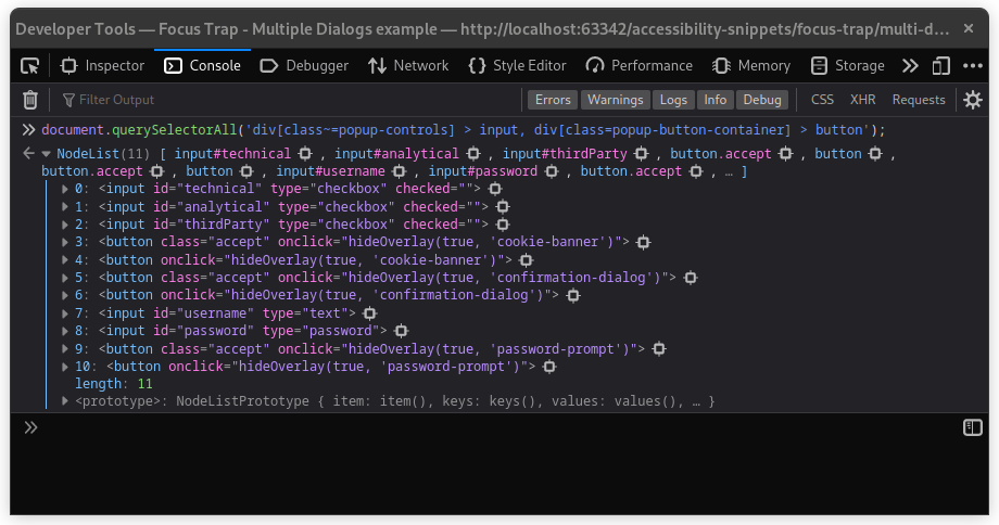
Revisit the selector for focusableElements. There are no changes necessary to
the selector, but what happens afterwards.
const focusableElements = Array.from(document
  .querySelectorAll(
    "div[class~=popup-controls] > input, div[class=popup-button-container] > button",
  ));
This selector will return all controls that exist within the different windows, independent of their visibility.
Obviously, we can’t blindly cycle through that NodeList.
Instead of re-executing the query selector on each Tab keydown event, I think
the appropriate solution is to scrape all those elements and put them into a
collection with the <dialog> parent element as key. This way, there won’t be
much overhead in the listener as the code organizing the elements and querying
the DOM will only be called once. Add a scrape function like shown below.
const scrape = (element, map) => {
  const key = element.closest("dialog");
  let value = map.get(key);

  if (!value) {
    value = [];
  }

  value.push(element);

  map.set(key, value);
};
Then, adapt the DOMContentLoaded event listener to call the function.
document.addEventListener("DOMContentLoaded", () => {
  const focusableElements = Array.from(document
    .querySelectorAll(
      "div[class~=popup-controls] > input, div[class=popup-button-container] > button",
    ));

  const elementsByDialog = new Map();

  focusableElements.forEach((element) => {
    scrape(element, elementsByDialog);
  });

  // ...
});
When listening on the Tab keydown event, this allows us to get the array of
focusable elements by simply querying the DOM for the currently active dialog.
After that, we can determine the appropriate first and last element to call
the trap function.
document.addEventListener("keydown", (e) => {
  const overlay = document.querySelector("dialog.popup-overlay.modal");

  // focus trap is inactive
  if (!overlay) {
    return;
  }

  const dialogElements = elementsByDialog.get(overlay);

  const first = dialogElements[0];
  const last = dialogElements[dialogElements.length - 1];

  if (overlay && e.key === "Tab") {
    if (!dialogElements.includes(e.target)) {
      trap(e, first);
    } else if (e.target === last && !e.shiftKey) {
      trap(e, first);
    } else if (e.target === first && e.shiftKey) {
      trap(e, last);
    }
  }
});
As a result, we now have a reusable <dialog> component with a focus trap that
automatically adapts for the currently visible modal window that does not
require any additional intervention, allowing the addition of new controls
without further ado.
You can find the working example on my GitHub page and on JsFiddle.
Common Roving Tabindex Use Cases