Developing with Accessibility in Mind
Given the legislative implications of the European Web Accessibility Act and Directive, developers need to know how assistive technology processes web content in order to meet the WCAG2.1 requirements. Once you grasped the fundamentals, you realize it’s just a different way of thinking when it comes to testing your work.
Table of Contents
- Assistive Technology
- How a Browser Works
- The Accessibility Tree
- ARIA landmarks
- Focus
- Contrast
- Metadata and Language
- Images
- Headings
- Conclusion
Assistive Technology
Assistive technology is any piece of hard- or software that allows users to access web content. This could be a screen reader, a refreshable braille display or something basic that has been built into desktop operating systems since forever: screen magnification software.
The goal as web developer that develops front-ends with accessibility in mind is not only fulfilling the minimum requirement for assistive technology to access the web content, but also provide a user experience similar to users that do not rely on assistive technology.
That said, the same amount of work for that fancy parallax effect to make the hero image the star of your page should be invested in making the same image accessible. Optimizing your web content for people with disabilities should always be seen as equally important as putting effort into the visual representation.
How a Browser Works
Take this with a grain of salt, because for the sake of simplicity it’s less trivial than I’ll explain here.
A user will usually try to access your website by using a browser of their choice. By putting the URL into the search bar and hitting the enter key, the browser sends a request to the server that hosts your content. The server then answers with a markup blob containing your page that is to be processed by your browser to create a DOM tree. The DOM tree will be used to render a visual representation with changes applied in real-time.
“The W3C Document Object Model (DOM) is a platform and language-neutral interface that allows programs and scripts to dynamically access and update the content, structure, and style of a document.” — https://www.w3schools.com/js/js_htmldom.asp
Manipulating the DOM can result in changes of the visual representation. Think of JavaScript functions that dynamically inject elements so that content pops up when the user interacts with an accordion. It is a common misconception that assistive technology - like screen readers - uses the visual representation built by the browser. Based on the user agent, the browser will create something that is called The Accessibility Tree from the DOM.
The Accessibility Tree
The Accessibility Tree does not care for your CSS tricks and effects, but how your markup is structured. Let’s assume
that somewhere in your HTML document a markup like this exists while the <h1> is somewhere else in the page.
<main>
  <section>
    <h2>
      Input Form
    </h2>
    <p>
      Please add the additional information.
    </p>
  </section>
  <section>
    <form>
      <label for="feedback">Feedback:</label>
      <textarea id="feedback"></textarea>
      <button>Submit</button>
    </form>
  </section>
</main>
The matching accessibility tree could look like the one in the picture below.

A screen reader would announce this structure to the user by processing it vertically, then horizontally starting from
the left, recursively until the last child has been processed. In this case, when the software reaches <main>, the
left <section> will be processed first; with the <h2> and then the <p> (paragraph), before it will jump to the
next <section>, going through the <label>, the <textarea> and finally the <button>.
Sometimes developers unintentionally mess up how the markup is structured. I saw people putting those two sections into a grid and swapping them with CSS grid attributes, so they appear in their logical order in the GUI. Maybe there were more elements before that got removed during the development process. Let’s look at the markup below or in this JsFiddle.
<main class="main-grid">
  <section class="section-form">
    <form>
      <label for="feedback">Feedback:</label>
      <textarea id="feedback"></textarea>
      <button>Submit</button>
    </form>
  </section>
  <section class="section-head">
    <h2>
      Input Form
    </h2>
    <p>
      Please add the additional information.
    </p>
  </section>
</main>
Those elements are to be rearranged with the following CSS:
.main-grid {
  display: grid;
}

.section-form {
  grid-row: 2;
}

.section-head {
  grid-row: 1;
}
Now everything appears in their place in the GUI. The accessibility tree, however, looks like this:

Obviously, those sections are swapped. The order in the DOM is wrong because of the falsely structured markup, resulting in bad user experience for assistive technology.
Announcement of Elements
So-called interactive content will be announced by screen readers, in short, that’s anything but <div> or <span>
elements. Let’s jump to the <form> and how its controls will be announced to the user.
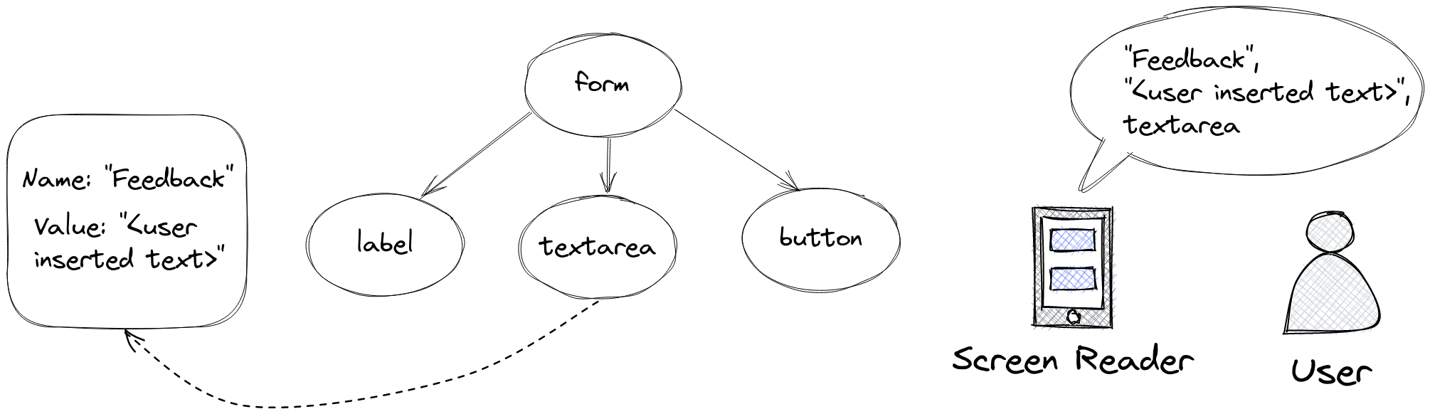
Form controls can have a name, a value and a role. The role defers from the type attribute of your <input>
element. In this case, it’s a type="textarea" input element.
Assistive technology will start with the name value, look for a matching <label> element using the for attribute
and announce the label text as form control name. It is important to always add labels to your controls! After that,
the value value followed by the role will be announced. The button will be announced similarly. HTML5 <button>
elements have role="button" implied.
ARIA landmarks
ARIA landmarks help assistive technology traverse through the page. With HTML5 new elements came to life, for example
<header>, <main>, <section> and <footer>. Those directly translate to <div> containers with an appropriate
aria-role set. The figure below shows two accessibility trees that are semantically the same.

I argue that the tree shown on the right side is much easier to understand. The aria-role provides additional
information about what to expect from the element. The <main> element can be used to skip other parts of the page
altogether and is used by the browser’s reader mode to omit all unnecessary content.
Focus
As a rule of thumb, your page should be navigable with keyboard only. Try unplugging your mouse and see how well you do. Think of how very old user interfaces back from the 80’s work that can be operated without any special pointing device. Aside from various arbitrary shortcuts, that should be your goal because screen readers work like that: Interactive elements can be focused, and you cycle through the focus order by pressing the TAB key.
Natural Focus Order
Assistive technology cares about the DOM’s structure. The natural focus order will follow the elements appearance in the DOM. That said, if you had a markup like this:
<main>
    <section>
        <h2>Cats</h2>
        <p>A paragraph describing cats.</p>
        <div>
            <img src="cat1.jpg" alt="Benny is a fluffy cat with brown fur.">
            <img src="cat2.jpg"
                 alt="Col. Fluffles is a british blue short-hair.">
        </div>
    </section>
    <section>
        <h2>Dogs</h2>
        <p>A paragraph describing dogs.</p>
        <div>
            <img src="dog1.jpg"
                 alt="James, the Golden Retriever, likes to swim.">
            <a href="/dogs/james">More Information about James.</a>
        </div>
    </section>
</main>
An accessibility tree will be created with the following focus order.

The cat-related <h2>, paragraph and images come first, after that it’s the dog-related content’s turn with another
<h2>, paragraph, an image and a hyperlink. You might be confused why some elements do not have an index assigned.
Only interactive content can receive focus. A <div> has no semantic meaning as it serves as a container and thus
cannot receive focus. This behaviour can be changed. Also, implementing a custom focus order is sometimes necessary,
but that is very difficult to maintain. To do so, you need to understand how the tabindex works.
The tabindex attribute
The tabindex is a global attribute that indicates whether an element can be focused or not.
If a tabindex is set
- to -1, it removes the element from the focus order. It can’t be focused when tabbing, but its children can. This is
not to be confused with
aria-hidden=true. - to 0, originally non-focusable elements will be added to the natural focus order. This is often used to make
non-interactive content - e.g. a
<div>- interactive. - to a value greater than zero, the natural focus order will be ignored at first. All elements with such a value set
will be cycled through until the natural focus order - elements with
tabindex=0- can be applied.
Using values above zero is discouraged because it leads to problems in regard to maintainability. Elements with the same tabindex value will be cycled through sequentially with their order depending on their position in the DOM. This often results in unintended behaviour.
Let’s say you have the following markup implemented as a widget in a frontend-framework of your choice (use your
imagination - Subheading and Subtext will be substituted by params).
<div>
    <h2 tabindex="1">{Subheading}</h2>
    <p tabindex="2">
        {Subtext}
    </p>
</div>
Assuming that no other custom focus order has been defined in the DOM, the rank 2 heading is the first element to be focused, with the paragraph coming right after. After that, everything else on the page that uses this widget follows. If you were to use this widget not once per page, but, let’s say, five times, the focus order would be broken. At some point your rendered markup could look like this:
<main>
  <div>
    <h2 tabindex="1">Subheading 1</h2>
    <p tabindex="2">
      Subtext 1
    </p>
  </div>
  <div>
    <h2 tabindex="1">Subheading 2</h2>
    <p tabindex="2">
      Subtext 2
    </p>
  </div>
  <div>
    <h2 tabindex="1">Subheading 3</h2>
    <p tabindex="2">
      Subtext 3
    </p>
  </div>
  <div>
    <h2 tabindex="1">Subheading 4</h2>
    <p tabindex="2">
      Subtext 4
    </p>
  </div>
  <div>
    <h2 tabindex="1">Subheading 5</h2>
    <p tabindex="2">
      Subtext 5
    </p>
  </div>
</main>
A screen reader would announce all rank 2 headings first, followed by all paragraphs. Usually this is not the user experience you want to implement.

Not to mention it would interfere with other widgets that potentially could implement an own focus order. There is no way to maintain it, especially if multiple developers are involved.
The Problem with Legacy
It’s always easier to optimize your web content for screen readers when working on a green field project. I pity those who are forced to implement accessibility into their old customer portals that have been built many years ago instead of redoing them from scratch for obvious reasons.
If you remember how the browser market looked like 10-15 years ago, you might have some flashbacks because optimizing front-ends for all browsers was an impossible task. Incompatibilities for some JavaScript and CSS functions existed even between versions of the same browser when you think about the beloved Internet Explorer. Thankfully those times are long gone by now, you might criticise today’s supreme reign of Chromium for political reasons - I’ve been an avid Firefox user since 2006 - but from a seasoned front-end developer’s point of view it’s a blessing to only support two browser engines.
However, back then even basic tasks like styling a button was a chore. A <div> on the other hand could be styled with
less effort. That lead to developers becoming creative and using <div> elements as buttons in disguise. Obviously,
this is not considered the best practise and results in accessibility problems. Let’s have a look.
<div class="fancy-button"
     onclick="submitClicked()">
    Submit
</div>
You see markups like this everywhere, but here’s the thing.
A <div> has no semantic meaning as it only describes its children. In this case, there are no children.
The text should be wrapped into a paragraph. Yes, the browser absolutely will render text without a paragraph, but
it is discouraged to implement it this
way.
When it comes to accessibility, screen readers will ignore this element altogether because it is
non-interactive content. Putting the text into a paragraph will cause the software to read Submit out loud, but
the user won’t be able to trigger the onclick event. You need to make this non-interactive content interactive by
adding it to the natural focus order - simply said, set the tabindex to zero.
Also, a <div> element has no implications when it comes to the aria-role, leaving the user clueless of what to
expect.
A corrected markup could like the one below.
<div class="fancy-button"
     onclick="submitClicked()"
     tabindex="0"
     role="button">
    <p>
        Submit
    </p>
</div>
As alternative, you could omit the paragraph altogether and set the Submit text into the aria-label attribute
at the cost of redundancy when it comes to button labeling. The best practise, however, would be using the proper HTML5
elements for the whole ordeal.
<button class="fancy-button"
        onclick="submitClicked()">
    Submit
</button>
Contrast
The distinguishable principle of WCAG2.1 describes a few different contrast ratios. Those apply to descriptive text only. It is not required to change your whole corporate identity around those ratios.
To meet Level AA, a ratio of 4.5 : 1 for text is required and at least 3 : 1 for headings.
The visual presentation of text and images of text has a contrast ratio of at least 4.5:1, except for the following:
- Large Text: Large-scale text and images of large-scale text have a contrast ratio of at least 3:1;
- Incidental: Text or images of text that are part of an inactive user interface component, that are pure decoration, that are not visible to anyone, or that are part of a picture that contains significant other visual content, have no contrast requirement.
- Logotypes: Text that is part of a logo or brand name has no contrast requirement.
For Level AAA - the highest conformance level you can aim for - a ratio of 7 : 1 is required with at least 4.5 : 1 for headings.
The visual presentation of text and images of text has a contrast ratio of at least 7:1, except for the following:
- Large Text: Large-scale text and images of large-scale text have a contrast ratio of at least 4.5:1;
- Incidental: Text or images of text that are part of an inactive user interface component, that are pure decoration, that are not visible to anyone, or that are part of a picture that contains significant other visual content, have no contrast requirement.
- Logotypes: Text that is part of a logo or brand name has no contrast requirement.
Mozilla Firefox has an automatic conformance check built in its dev tools that allows you to check WCAG2.1 conformance when interacting with the color picker. I can also recommend the WebAIM Contrast Checker Tool to quickly test your color combinations.
Metadata and Language
Search Engine Optimization improves web accessibility. The title of your page is the first thing that gets announced
by a screen reader. A description will be read out loud when a potential visitor encounters your website on the result
page of a search engine. Setting the language of your site is crucial for screen readers to know what dialect to choose.
When it comes to responsiveness, the viewport meta tag should be set. Sometimes developers set the user-scalable
property to no for aesthetic purpose. Please refrain from doing so, it prevents users with bad eyesight from zooming
into the page to read the content.
This is the minimum you should provide in your markup:
<!DOCTYPE html>
<html lang="en">
    <head>
      <title>Your awesome website</title>
      <meta name="title" content="Your awesome website" />
      <meta name="description"
            content="This awesome website is very awesome." />
      <meta name="viewport"
            content="width=device-width, initial-scale=1, user-scalable=yes">
    </head>
</html>
Setting english as main language of your page does not mean that every text must be in english language. You can segment
multi-language text with the lang attribute and <span> elements.
<article>
  <h2>Hello in multiple languages</h2>
  <p>
    The word hello exists in all languages.
    In Spanish, it's <span lang="es">¡Hola!</span>,
    in German, it's <span lang="de">Hallo!</span>,
    in Polish, it's <span lang="pl">Cześć!</span>,
    in French, it's <span lang="fr">Bonjour!</span>.
  </p>
</article>
This way screen readers can load a different dialect depending on the segment while treating english as primary language.
Images
Each image must have an alt value set. Not only is this attribute used when the image could not be loaded, but also it
serves as text alternative for screen readers.
<img src="cat.jpg">
Encountering this element in the accessibility tree, a screen reader would read “image” out loud. Imagine having not one, but five images. The user would hear “image, image, image, image, image” and would not gain anything from that information.
Setting the alt attribute provides a textual description.
<img src="cat.jpg" alt="A cute and fluffy cat.">
While I agree that this particular information is of utmost importance, I argue that sometimes images serve a solely
decorative purpose. To make a screen reader ignore the image, set the role to presentation and alt to an empty
string.
<img src="cat.jpg" alt="" role="presentation">
When providing a description, the description should exclusively describe the image itself. Copyright information should not be part of the description, that’s what captions are for.
Generally speaking, what should be provided heavily depends on the context the image is used in. An alternative description should aim for the right balance between providing useful information and getting to the point quickly.
Let’s look at the image below that’s obviously not a cat.

The problem with graphs like this is that you can interpret them in many ways. A perfectly fine, but slightly euphemistic image description could look like this:
<img src="graph.png" alt="The gross revenue reached about
450k over the last three months in 2021.">
There is no mention of the peak in August, of the abysmal performance from January to April and the drop in October.
Usually graphs are part of a business report that have a whole article dedicated to the company’s performance. If the
image is used in such context, it would be better to set role=presentation and an empty alt attribute because there
is no way an image description will provide more useful information than a whole article.
Headings
People still get this wrong. The number of rank 1 headings - or <h1> - on a page is exactly one. Then you move
downwards. You do not use a rank 6 heading - or <h6> - unless you put an <h5> above it in your markup.
Headings are used to skim your page, search engines will use them for indexing the structure of your web content. To make that possible, they need to follow the right order.
Personally, I saw this error becoming more common when the frontend-frameworks entered the market. The problems in
regard to maintainability for widgets are the same as tinkering with the tabindex, especially if multiple developers
are involved.
Conclusion
This was just a short technical introduction to the Web Accessibility topic. In my next few posts, I will share some techniques that are crucial when trying to make web content accessible. Dealing the with some of the topics I posted here for the very first time was really eye-opening and I think they are worth sharing.
Fixing a Missing Android Platform in IntelliJ