
Dark Theme Toggle in Astro
A few weeks ago I evaluated a few static site generators for this site, and I’m really happy with what Astro has to offer. I try to aim for a rather minimalistic page design, but want to provide some convenience for visitors. I thought about what I liked on pages I visited and wished more pages on the web have. One of those things is a dark theme that automatically adapts to your preferred setting on the OS, but can be toggled as you wish. Also, I like to use pure HTML, CSS and JavaScript rather than major frameworks.
One of Astro’s features is that unnecessary JavaScript will be omitted during build to improve loading times. When it comes to interactive elements, you need to use some directives to exclude them from the removal process.
So, I had to wrap my head around a problem I totally did not have on my radar.
Table of Contents
The Problem
Client side JavaScript manipulation can only be performed after the page load
happened. I implemented a slider with some fancy transform animations that is
controlled by a checkbox. The checkbox is unchecked by default, on my site that
means the light theme is selected. As my site does not use any cookies, the
selection is stored in the browser’s localStorage.
The markup I use looks like this.
<div class="toggle-container">
  <i class="fa fa-sun light"></i>
  <div>
    <label class="switch" aria-label="Switch theme">
      <input
        id="{id}"
        class="theme-toggle"
        type="checkbox"
        onclick="togglePreference()"
      />
      <span class="slider round"></span>
      <span class="slider-label">Toggle theme</span>
    </label>
  </div>
  <i class="fa fa-moon dark"></i>
</div>
And somewhere the localStorage gets evaluated.
const getColorPreference = () => {
  let preference = localStorage.getItem(storageKey);

  if (!preference) {
    preference = window.matchMedia("(prefers-color-scheme: dark)").matches
      ? "dark"
      : "light";
  }

  return preference;
};
Credit’s due, there is some CSS I used from the W3C toggle template.
Because all pages you can visit on this website are pre-generated, all of them
have an unchecked checkbox and some logic that pulls the setting from the
localStorage. Because of the animation, visitors who have the dark theme
configured would see a ‘jumping’ toggle. Look at the video below.
As a quick fix I swallowed my pride and ditched the animation. But you could still see the switch from light to dark in split seconds. Technically, the only ‘right’ way to fix this would be generating a page for each checkbox state, resulting in a ‘dark’ and ‘light’ version of the page with separate slugs and that’s a big no for me.
I can’t possibly be the only one dealing with this problem, so how did others
solve it? They also cheated. Even the
official Astro documentation
uses the
localStorage JavaScript approach
and no fancy animation on their toggle. My keen eye spotted that their page has
the same problem as well as other Astro generated sites I found. Some of them
even had fancy sliders implemented and seemingly gave up fixing them.
CSS3 to the Rescue
I used data-* attributes to define theme colors, but it did not occur to me
that you can use this for other values as well, e.g. translateX.
All I had to do was to define an initial value for the slider’s position, like this…
:root[data-theme="light"] {
  /* ... */
  --theme-slider-initial-transform: 0px;
}

:root[data-theme="dark"] {
  /* ... */
  --theme-slider-initial-transform: translateX(24px);
}
… and apply it to the :before pseudoclass.
.slider:before {
  position: absolute;
  content: "";
  height: 18px;
  width: 18px;
  left: 3px;
  bottom: 3px;
  transform: var(--theme-slider-initial-transform);
  transition: 0.4s;
}
Any other CSS class that applies translateX on the checkbox checked
pseudoclass should be removed. This way, the slider reacts to the data-theme
property instead of the checked value. The checkbox now only serves as element
that makes sure togglePreference() gets called.
Building it from Scratch
Some snippets thrown here and there are confusing. Create a new Astro project
with npm create astro@latest. I chose the ‘personal website’ template.
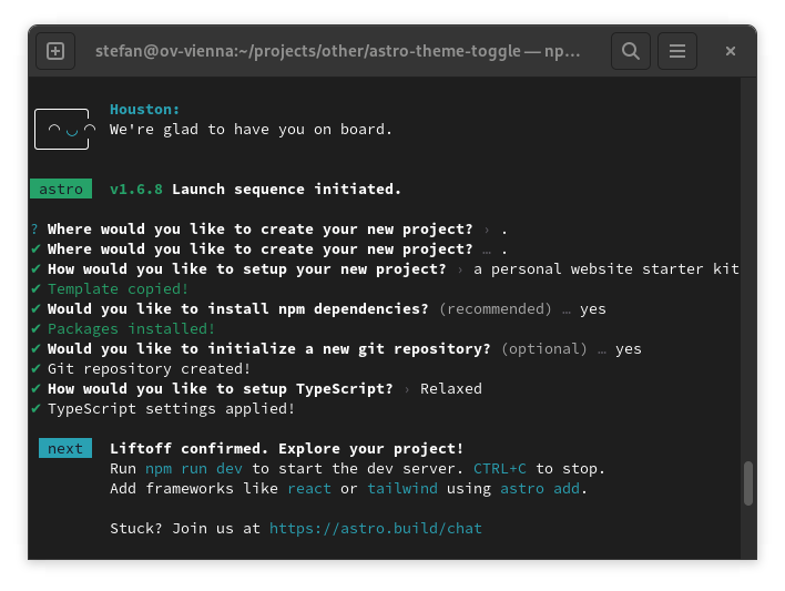
This will create a template based on the lovely bear blog with enough pages to test everything and simple enough to expand. Open the project in an IDE of your choice.
There is no theme defined yet, so scrape all those color-related values you find
in src/styles/global.css and put them into a root[data-theme="light"]
definition. Create a second one called root[data-theme="dark"] and adapt those
colors to anything you consider pretty. Mine looks like this.
:root[data-theme="light"] {
  --background-color: #fff;
  --color: #444;
  --heading-color: #222;
  --link-color: #3273dc;
  --link-visited-color: #193c75;
  --code-background-color: #c7c7c7;
  --theme-slider-initial-transform: 0px;
  --light-theme-indicator-color: #ffcf00;
  --dark-theme-indicator-color: var(--color);
}

:root[data-theme="dark"] {
  --background-color: #444;
  --color: #fff;
  --heading-color: #f1f1f1;
  --link-color: #de9906;
  --link-visited-color: #966807;
  --code-background-color: #252525;
  --theme-slider-initial-transform: translateX(24px);
  --light-theme-indicator-color: var(--color);
  --dark-theme-indicator-color: #ffcf00;
}
Afterwards, create a new component called ThemeSlider in a file
src/components/ThemeSlider.astro.
---
const { id } = Astro.props;
---
<div class="toggle-container">
    <span class="light">
        light
    </span>
    <div>
        <label class="switch" aria-label="Switch theme">
            <input id={id} class="theme-toggle" type="checkbox"
                onclick="togglePreference()" />
            <span class="slider round"></span>
        </label>
    </div>
    <span class="dark">
        dark
    </span>
</div>
The id is necessary to identify the <input> control element to pair with a
<label>. When using ThemeSlider, you need to set the id property like
this: <ThemeSlider id="theme-toggle">.
I opted for the
W3C toggle example with
round edges and some minuscule changes in size. The CSS I use looks like this
and can be appended in the ThemeSlider.astro file with matching <style>
tags.
.theme-toggle {}

.toggle-container {
  display: flex;
  flex-direction: row;
  align-items: center;
  gap: 0.5em;
}

.light {
  color: var(--light-theme-indicator-color);
}

.dark {
  color: var(--dark-theme-indicator-color);
}

.switch {
  position: relative;
  display: inline-block;
  width: 48px;
  height: 24px;
}

.switch input {
  opacity: 0;
  width: 0;
  height: 0;
}

.slider {
  position: absolute;
  cursor: pointer;
  top: 0;
  left: 0;
  right: 0;
  bottom: 0;
  background-color: var(--link-color);
  transition: 0.4s;
}

.slider:before {
  position: absolute;
  content: "";
  height: 18px;
  width: 18px;
  left: 3px;
  bottom: 3px;
  background-color: var(--color);
  transform: var(--theme-slider-initial-transform);
  transition: 0.4s;
}

input:checked + .slider {
  background-color: var(--link-color);
}

input:focus + .slider {
  box-shadow: 0 0 5px var(--link-color);
}

.slider.round {
  border-radius: 34px;
}

.slider.round:before {
  border-radius: 50%;
}
Add a ThemeSlider component into the src/components/Header.astro.
<div class="header-container">
  <nav>
    <HeaderLink href="/">Home</HeaderLink>
    <HeaderLink href="/blog">Blog</HeaderLink>
    <HeaderLink href="/about">About</HeaderLink>
    <HeaderLink href="https://twitter.com/astrodotbuild" target="_blank"
    >Twitter</HeaderLink>
    <HeaderLink href="https://github.com/withastro/astro" target="_blank"
    >GitHub</HeaderLink>
  </nav>
  <ThemeSlider id="theme-toggle" />
</div>
header-container is just a simple flexbox that aligns the <nav> on the left,
and our new toggle on the right side.
.header-container {
  display: flex;
  justify-content: space-between;
  align-items: center;
}
The last jigsaw is calling togglePreference() and setting up the
localStorage evaluation. Create a new file in public/lib/ called
theme-util.js and look at the JavaScript code below.
const storageKey = "theme-preference";

const getColorPreference = () => {
  let preference = localStorage.getItem(storageKey);

  if (!preference) {
    preference = window.matchMedia("(prefers-color-scheme: dark)").matches
      ? "dark"
      : "light";
  }

  return preference;
};

const setPreference = (themeName) => {
  localStorage.setItem(storageKey, themeName);

  document.firstElementChild
    .setAttribute("data-theme", themeName);
};

const togglePreference = () => {
  setPreference(getColorPreference() === "dark" ? "light" : "dark");
};

(() => {
  const theme = getColorPreference();

  setPreference(theme);
})();
This code will ensure that the storageKey value will be evaluated and the
data-theme property will be set appropriately. Append the util as resource in
src/components/BaseHead.astro.
<!-- Theme Util -->
<script src="/lib/theme-util.js" type="text/javascript" is:inline></script>
That’s it! It was less work than expected and now there is no jumping visible. You find the full example on my GitHub page.
Implementing Focus Traps